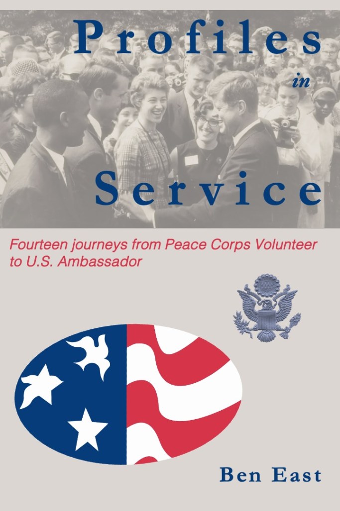
This is my first attempt to design a jacket for this book.

What I like about it: The Peace Corps logo of the star transforming into the dove has always inspired me. The first time I really remember seeing it was painted on the Peace Corps headquarters building when my group arrived in Lilongwe. Adding the eagle from the State Department’s Great Seal of the United States seems the right next evolution. I like the rbg level of blue and red in the Peace Corps logo, which I use for the title, subtitle, and author citation. I like the image of Kennedy meeting volunteers in the Rose Garden in 1962.
What I don’t like about it: It looks raw and home-made. The title font works well enough but not the subtitle font. The Peace Corps logo and the Great Seal don’t tie together in any real way. The plainness of the background, a grey tone taken from the black and white image of Kennedy meeting volunteers in the Rose Garden in 1962. There is too much space; this might be ok, leaving room later for a blurb of some kind.
Recommendations: What fonts would you recommend for the title (currently Garamond) and subtitle (currently Helvetica)? Can you recommend a free and simple font design site to recommend? Should the cover have more color; how do we bring the black-and-white image at the top into harmony with the red, white, and blue of the lower half of the cover?
By the way, this is not my first time designing a jacket. That turned out disastrously: the cover for my novel, Two Pumps for the Body Man: a Diplomatic Noir, was featured on a trashy site called lousybookcovers(dot)com. The site basically shames honest (if faulty) artistic efforts in order to pitch its own book cover design services.
##

Leave a reply to Ben East Cancel reply