This is my first attempt to design a jacket for this book.

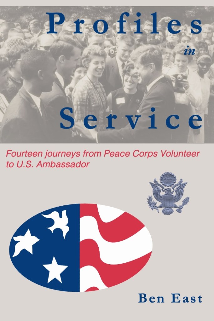
What I like about it: The Peace Corps logo of the star transforming into the dove has always inspired me. The first time I really remember seeing it was painted on the Peace Corps headquarters building when my group arrived in Lilongwe. Adding the eagle from the State Department’s Great Seal of the United States seems the right next evolution. I like the rbg level of blue and red in the Peace Corps logo, which I use for the title, subtitle, and author citation. I like the image of Kennedy meeting volunteers in the Rose Garden in 1962.

What I don’t like about it: It looks raw and home-made. The title font works well enough but not the subtitle font. The Peace Corps logo and the Great Seal don’t tie together in any real way. The plainness of the background, a grey tone taken from the black and white image of Kennedy meeting volunteers in the Rose Garden in 1962. There is too much space; this might be ok, leaving room later for a blurb of some kind.

Recommendations: What fonts would you recommend for the title (currently Garamond) and subtitle (currently Helvetica)? Can you recommend a free and simple font design site to recommend? Should the cover have more color; how do we bring the black-and-white image at the top into harmony with the red, white, and blue of the lower half of the cover?

By the way, this is not my first time designing a jacket. That turned out disastrously: the cover for my novel, Two Pumps for the Body Man: a Diplomatic Noir, was featured on a trashy site called lousybookcovers(dot)com. The site basically shames honest (if faulty) artistic efforts in order to pitch its own book cover design services.

##


Discover more from Ben East Books

Subscribe to get the latest posts sent to your email.


Comments

6 responses to “Fooling around with cover art”

  1. amy coffee Avatar
    amy coffee

    Ok, challenge accepted. Kate (16) is taking Graphic Design. Here is our feedback. We love the image of JFK / Rose garden. I would like to see it bigger, (could it be the whole cover?) Kate suggested moving it into the middle of the cover. She thought you should try putting the title at the top, above the picture, and Kate suggests an all caps serif font. Put the subtitle below the picture. I love the PCV image too, but the one here is oval, not round. It looks weird. We wondered about overlapping the PCV logo and the Great Seal. Maybe having the Great Seal overlap the red and white stripes. She also wondered about putting the two seals on the back cover instead? I like that as well. Love the words of the title. Study other historical titles to get ideas about pictures / font layout. What if you made the background that deep blue (or went a little navy), title white (with maybe an outline in black or grey or red) and your name in grey. Keeping the subtitle in red? Final question: should “journeys” be capitalized? Also reorganize the subtitle, put “Fourteen Journeys from” on one line and “Peace Corps Volunteer to US Ambassador” on the next. Or stack it in three lines, dividing PCVs and Ambassador into separate lines. Hug Ms. D for me. A

    Liked by 1 person

    1. Amy this is awesome. I am mulling and will be right back with questions and further appreciation to you and Kate.

      Like

  2. I wouldn’t try to make a horizontal photo cover the verticality of the cover. I’d play around with having the title start above the photo but overlap into the photo. Scratch that–would look terrible. I would center the word “in” (approximately under the “f” in Profiles). And then I think I would center the whole title, at least to see what it looks like. I think the formality of centered type conveys a “weighty-ness” that goes well with the seriousness of what you do. No comment on subtitle font other than that one surely ain’t it. I really like the idea of making it stay flush left, but I would break the line between “journeys” and “from” thus giving a line to “from Peace Corps Volunteer” before it breaks again for “to U.S. Ambassador”. I also would play with making each phrase of it different point sizes so that they’re of equal length; if not, try at least “Fourteen journeys” in a larger size.

    The bottom looks jumbled. I know what I would try, but bear in mind I just keep trying out crap until it looks good. I would see if flipping the vertical placement of elements works. Put the Peace Corps logo at 50% or so as the background to the top with the main title and subtitle overlaying it. (or maybe just the main title) Keep subtitle flush left, put your name opposite, flush right in a large font than the subtitle. Then the photo is at the bottom and it doesn’t have to be grayed to what, about 40%-50%? Put it at 100% or may 80-90%. You’ll not I didn’t address the other art element because I don’t think you have room on the cover for three.

    FWIW, I worked four years on weekly newspapers as sole or near-sole editor/photographer/reporter. Journalism degree (which taught me little). But I worked under a publisher who designed an award-winning look to Sacramento Bee, so there’s that. Frankly all of my suggestions might look like crap, but I’d keep moving things around, worry about the font a bit later. Overall one needs to think of everything as objects with weight. You seem to be attached to them as words, photo, and symbols, not as art elements.

    Like

    1. and I really like the idea of deep blue on the cover as suggested above. The design needs weight.

      Like

    2. This has been a super-helpful response and I’m incredibly grateful. I’ve had little time to play with it these past few weeks but this gives me assurance I’m on the right path that it is a matter of trial and error. I also appreciate the standard “rules” or concepts you lay out here and the general direction to achieve the tried and true. With much gratitude!

      Liked by 1 person

  3. Yep. (Nicely said considering how going my comment was. Very diplomatic.) Let me know when I can buy your book!

    Like

Leave a reply to pilchbo Cancel reply